When using terrace layouts, it’s important that any content you add is of the
highest possible quality. Our designs can only take you so far - adding high
resolution images and well written text will take you even further.
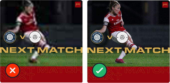
Low resolution is a no-no
We know it can be tempting to use low resolution images when you have nothing else on hand, but as you can see above, it can often look pretty terrible. You might want to consider using a layout that doesnt require an image instead.
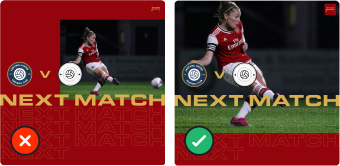
Fill the space
terrace allows you to scale and move your images within certain boundaries. For best results, we’d recommend you fill the available space, this is the simplest way of ensuring your layout looks its best. However, you may find in some instances that you have a bit of artistic license - we’ve been proven wrong before!
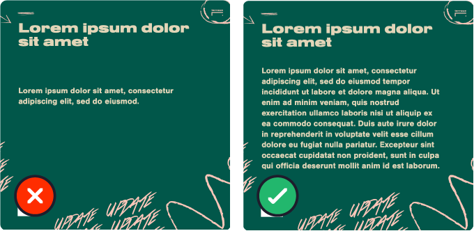
Don’t overdo it. Don’t underdo it.
As with everything else, terrace will limit the amount and size of text you can add to layouts to ensure they look their best. If you find yourself running out of space when typing then consider reducing the amount of text and adding it to the
caption when you upload your layout to social media. Several layouts contain simple tools that allow you to move and resize text if required.
Social media users don’t want to read tons of text on your image, they’d be more comfortable reading it in the caption - this also benefits you as it is how social media algorithms detect good content.
Remove the background
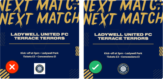
terrace will limit the size of your badge to suit the layout you are working with,
so largely, badges take care of themselves. For best results, ensure that your badge is a transparent png file. This means your badge has no coloured
background surrounding it.
We know this can be a pain, but there are some simple apps and resources out there that allow you to remove the background. We hope to have a solution to this in the future but until then we will happily remove the background for you if you email it to:
hello@terracesocial.co.uk
